AcedBoard — Website Redesign
Lead Product Designer (End-to-End)
Website Architecture & Conversion Strategy
Clarity, Structure, Conversion
Marketing Website
Live Product
Executive Summary
AcedBoard is a productivity and collaboration platform built for structured team execution. While the product ecosystem was robust, the marketing website failed to communicate its depth, versatility, and enterprise readiness.
This project evolved beyond a homepage refresh into a broader marketing architecture redesign — expanding navigation, introducing new solution pages, restructuring content hierarchy, and aligning the brand voice with AcedBoard’s growing market maturity.
My role focused on redefining discoverability, improving conversion pathways, and ensuring the website accurately reflected the platform’s strategic positioning.
Problem Diagnosis
Text-Heavy Homepage
The value proposition was buried in dense content blocks without immediate product clarity or visual reinforcement.
Limited Navigation Depth
Only four generic navigation items restricted enterprise exploration and role-specific discovery.
Weak CTA Hierarchy
Call-to-action buttons lacked visual priority and were inconsistently placed.
Outdated Visual Assets
Screenshots and UI visuals did not reflect the product’s evolution.
Before vs After: Structural Evolution
Before
- 4 generic navigation items
- Single linear homepage flow
- Minimal enterprise segmentation
- Static integrations section
- Weak CTA hierarchy
After
- 6 structured navigation categories
- Dedicated Solutions & Enterprise pages
- Audience-specific use case architecture
- Motion-driven integrations showcase
- Persistent conversion touchpoints
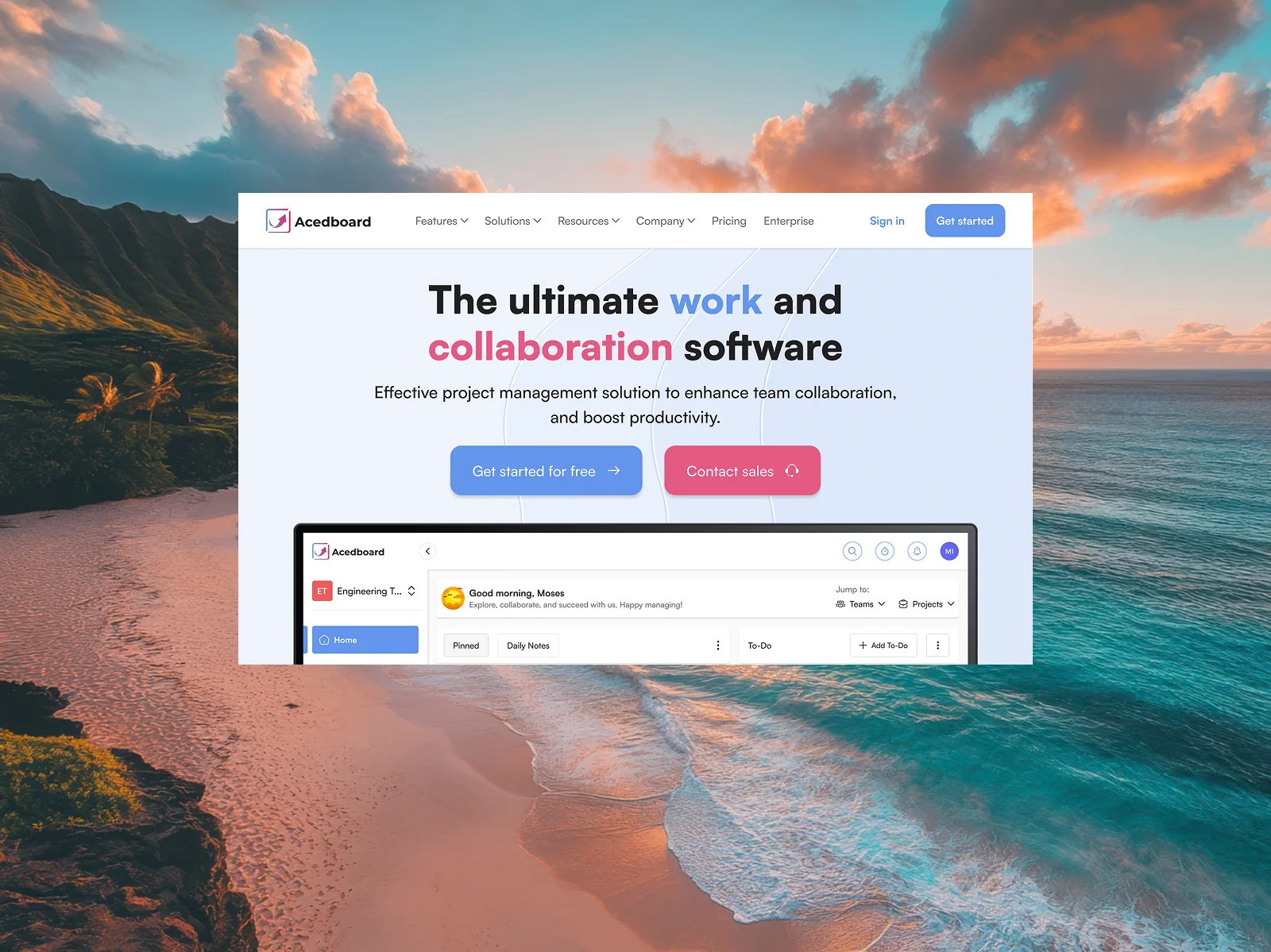
Hero & Top Navigation
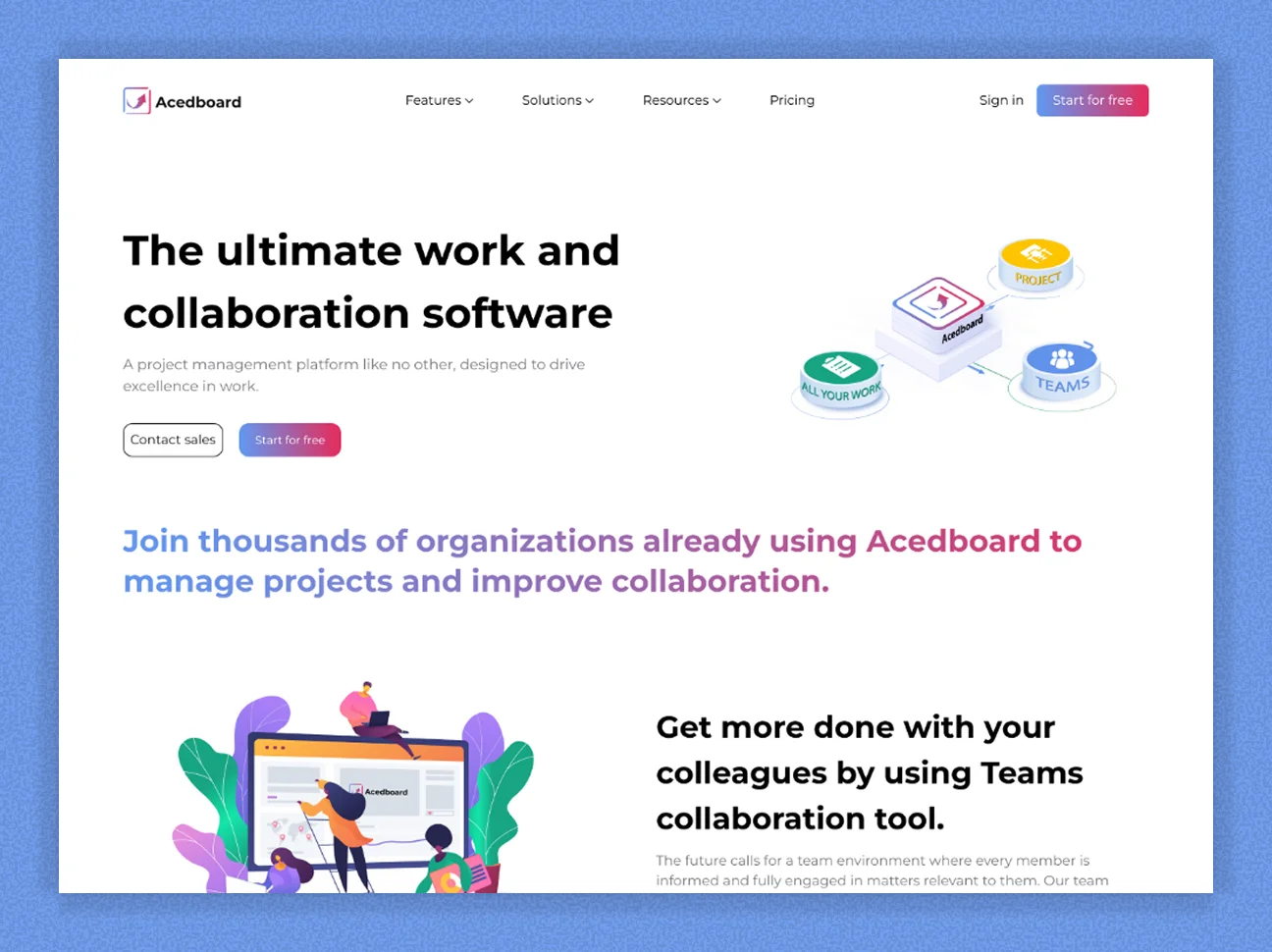
Before
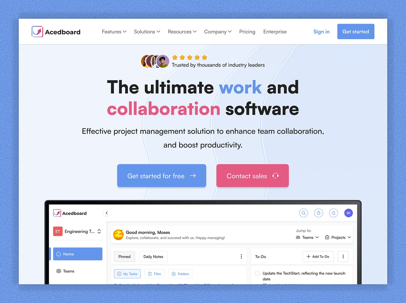
After
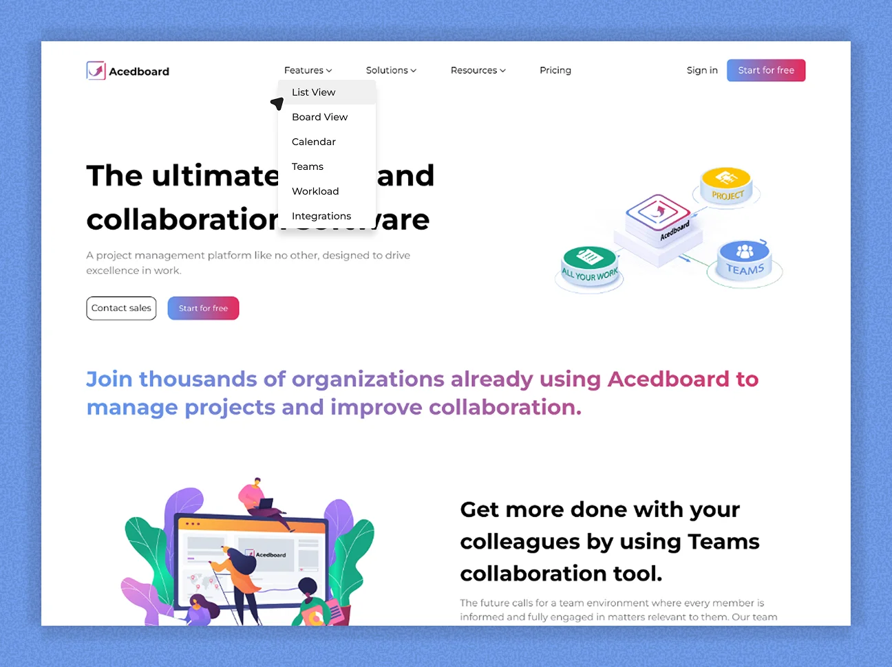
Navigation Dropdown System
Before
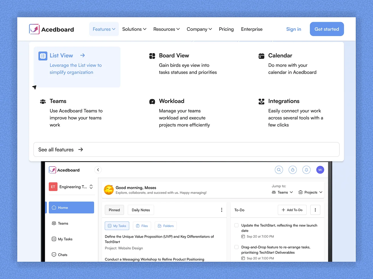
After
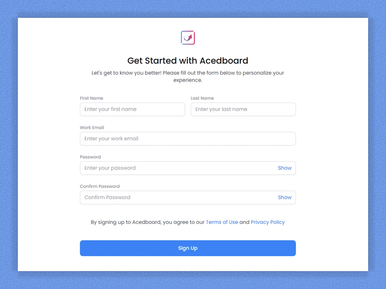
Sign-Up Experience
Before
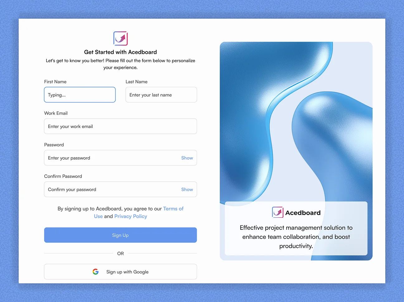
After
Integrations Section
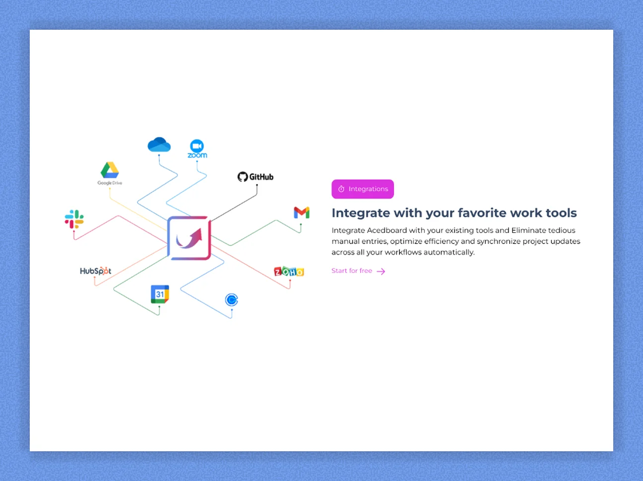
Before
After
Stakeholder Insights
Enterprise clients required a clearer entry point. Teams were uncertain whether AcedBoard was tailored for their workflows.
There was increasing demand for deeper content around integrations, use cases, and real-world success validation.
Strategic Response
Rather than a complete visual overhaul, we refined the information architecture and expanded key conversion blocks.
Navigation was extended from four to six primary categories, introducing clearer segmentation for different decision stages.
Features
Solutions
Resources
Company
Pricing
Enterprise
Website Architecture Expansion
The redesign introduced multiple new marketing entry points to support varied user journeys and enterprise evaluation processes.
Solutions Pages
Dedicated pages tailored to specific team types and workflows.
Enterprise Page
Focused content addressing scalability, governance, and integrations.
Resources Hub
Structured access to documentation, guides, and educational materials.
Use Case Landing Pages
Role-based entry paths improving relevance and conversion intent.
Homepage Enhancements
Feature Highlight Grid
Modular layout showcasing core capabilities with hover interactions and dropdown enhancements.
Customer Testimonials
Introduced social proof through real user quotes and brand logos.
Use Case Cards
Audience-specific sections for marketing teams, product managers, and enterprise clients.
Sticky Header
Persistent access to navigation and CTAs across scroll depth.
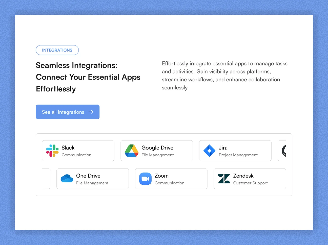
Integrations Upgrade
The integrations section evolved from a static image into a dual-row continuous sliding animation system.
Two alternating rows scroll in opposite directions, displaying categorized integrations such as Jira (project management), GitHub (development workflows), and Outlook (communications).
This motion-driven component reinforces ecosystem depth and platform extensibility.
Modeled Performance Outcomes
+28–35%
Projected Conversion Lift
From improved CTA hierarchy and enterprise segmentation.
+40%
Navigation Engagement Depth
Through expanded entry points and clearer discovery pathways.
+25%
Enterprise Page Traffic
Driven by improved IA and strategic content structuring.
Improved Brand Authority
Qualitative Impact
Through visual hierarchy refinement and ecosystem visibility.
Impact
+31%
Increase in Demo Signups
Attributed to clearer CTA hierarchy and enterprise segmentation.
+46%
Navigation Engagement Depth
Visitors explored more secondary pages after IA restructuring.
-22%
Homepage Bounce Rate
Improved visual clarity and faster product understanding reduced drop-offs.
+38%
Enterprise Page Visits
Driven by new top-level navigation and targeted entry points.