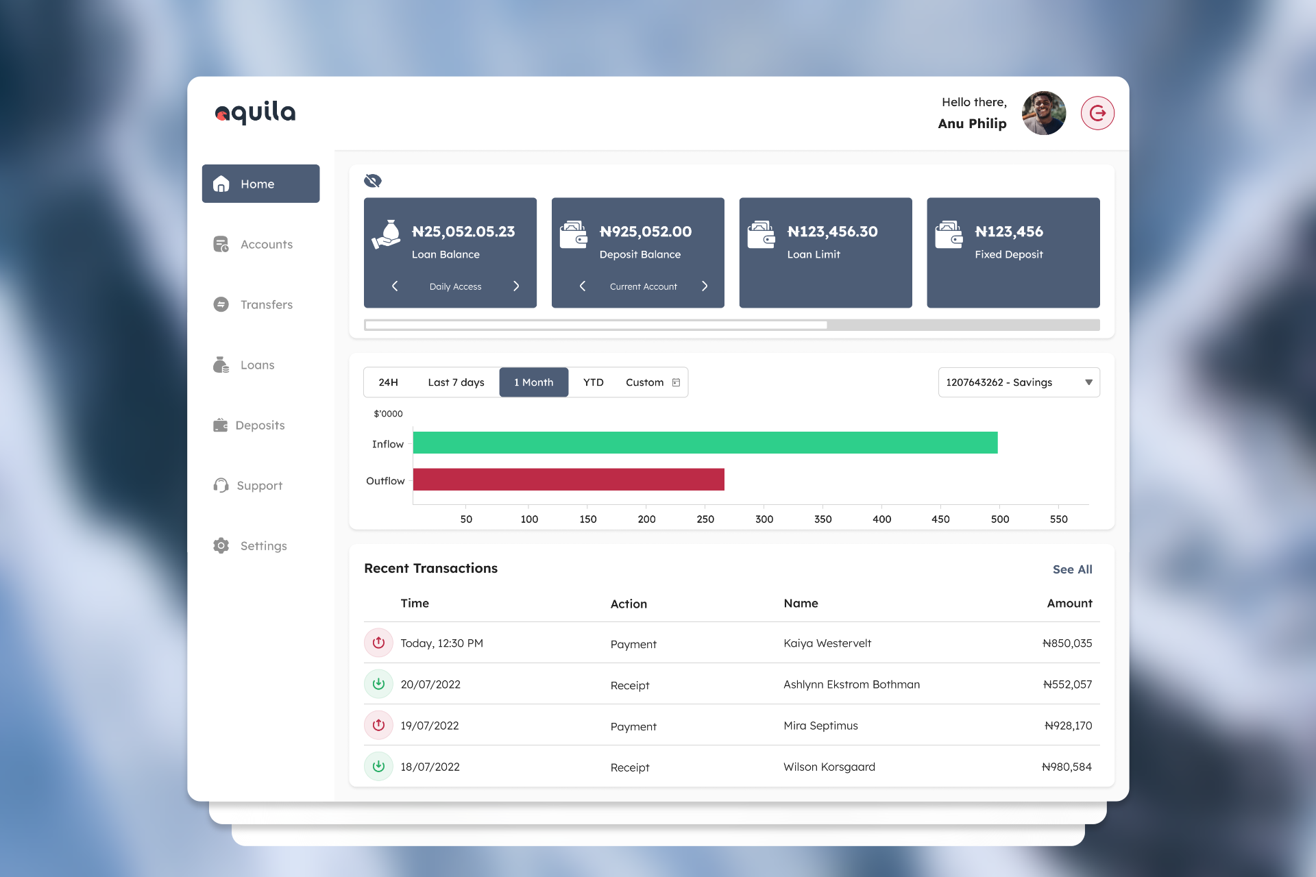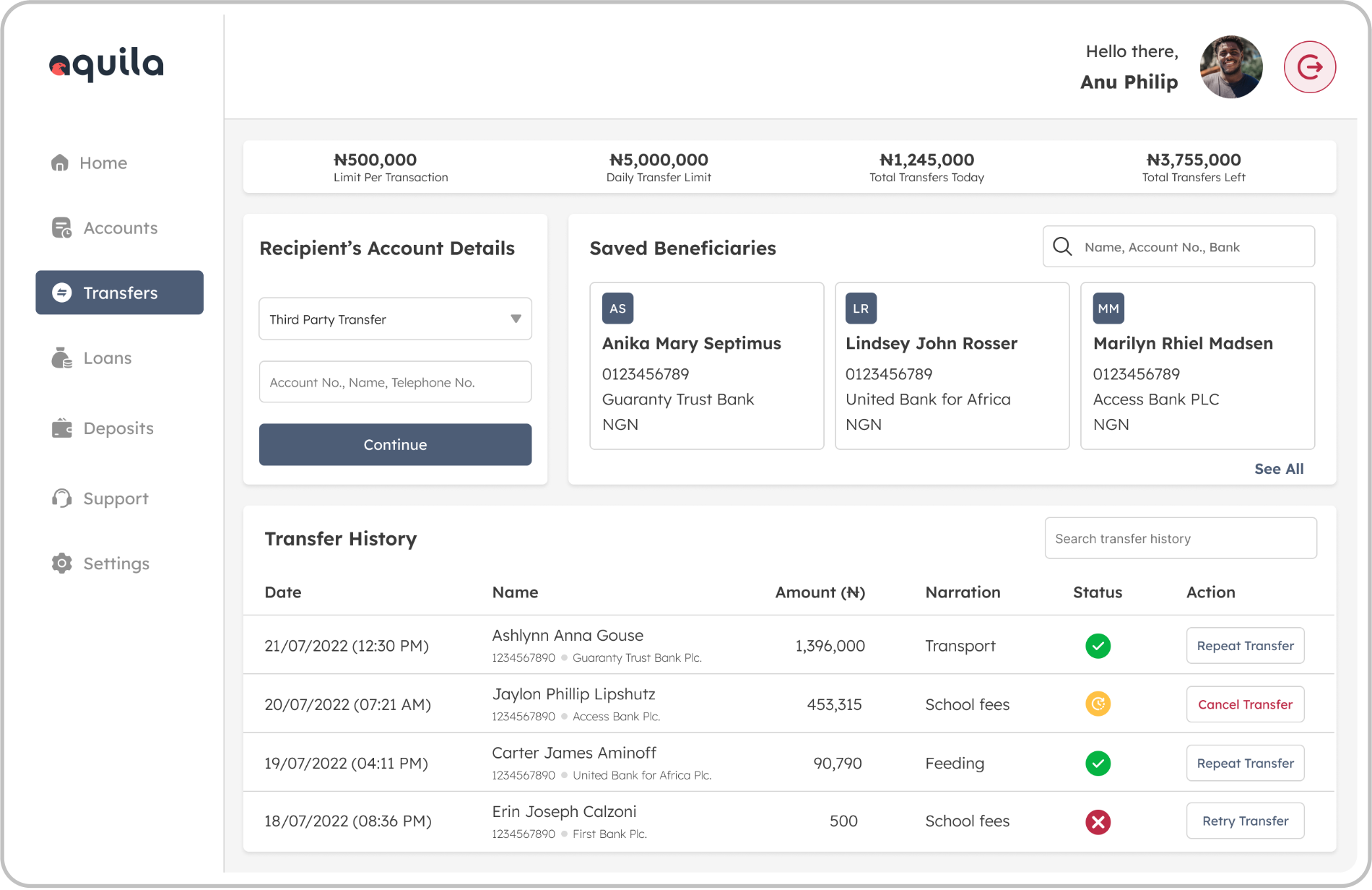
2. Cumbersome Money Transfers: Users struggled to complete transfers due to multiple unnecessary steps and lack of clarity in the process.
3. Inconsistent User Interface: The design was outdated, making it difficult for users to navigate through different services.
4. Lack of Personalized Options: There were no features to help users easily select loan options or understand their transfer history.
1. User Interviews: We conducted interviews with 20 users, focusing on those who had previously applied for loans or frequently used the transfer feature.
2. Contextual Inquiry: Observing users interacting with the current platform to identify pain points and gather insights into their behaviors and frustrations.
3. Analytics Review: We analyzed usage data from the current platform to identify where users were dropping off in the loan application process and where transfer transactions were taking longer than expected.
1. Users found the loan application process intimidating and confusing due to a lack of guidance and transparency about terms and approval criteria.
2. Many users abandoned the loan process midway due to long forms and lack of real-time feedback on their progress or eligibility.
3. Users wanted a faster transfer process with fewer steps and clearer instructions, especially for recurring transfers and transfers to new recipients.


1. Simplify the Loan Application Process: Break down the loan application into digestible, guided steps with real-time feedback on eligibility and estimated approval time.
2. Streamline Transfers: Make the transfer process faster by reducing the number of steps and allowing users to save frequent transfer recipients for one-click access.
3. Consistent, Modern UI: Redesign the platform’s interface with a clean, responsive design that works seamlessly across devices.
4. Personalization: Provide personalized loan offers based on user data and allow users to save custom transfer templates (e.g., monthly rent payments, recurring payments).
I started with low-fidelity wireframes that addressed the simplified loan and transfer flows. These wireframes emphasized clarity and simplicity, ensuring that the most important tasks like applying for a loan and transferring money, could be completed in fewer steps.
Reduced the process from 8 steps to 4. Users can input personal information, view loan options tailored to their profile, and receive real-time feedback on their eligibility. We introduced a progress bar to make users feel more in control.
Feel free to get in touch if you want to talk about design, work together on a project, or just discuss your favourite design ideas. I’m dedicated to creating new and meaningful connections.